A brand focused on learning for mental health and wellness
Well+
Who?
Well+ is an organization founded to promote the health and well-being of healthcare professionals and communities, across Taiwan. Through its learning and wellness activities, Well+ offers a service that improves individual, and the community’s well-being.
What?
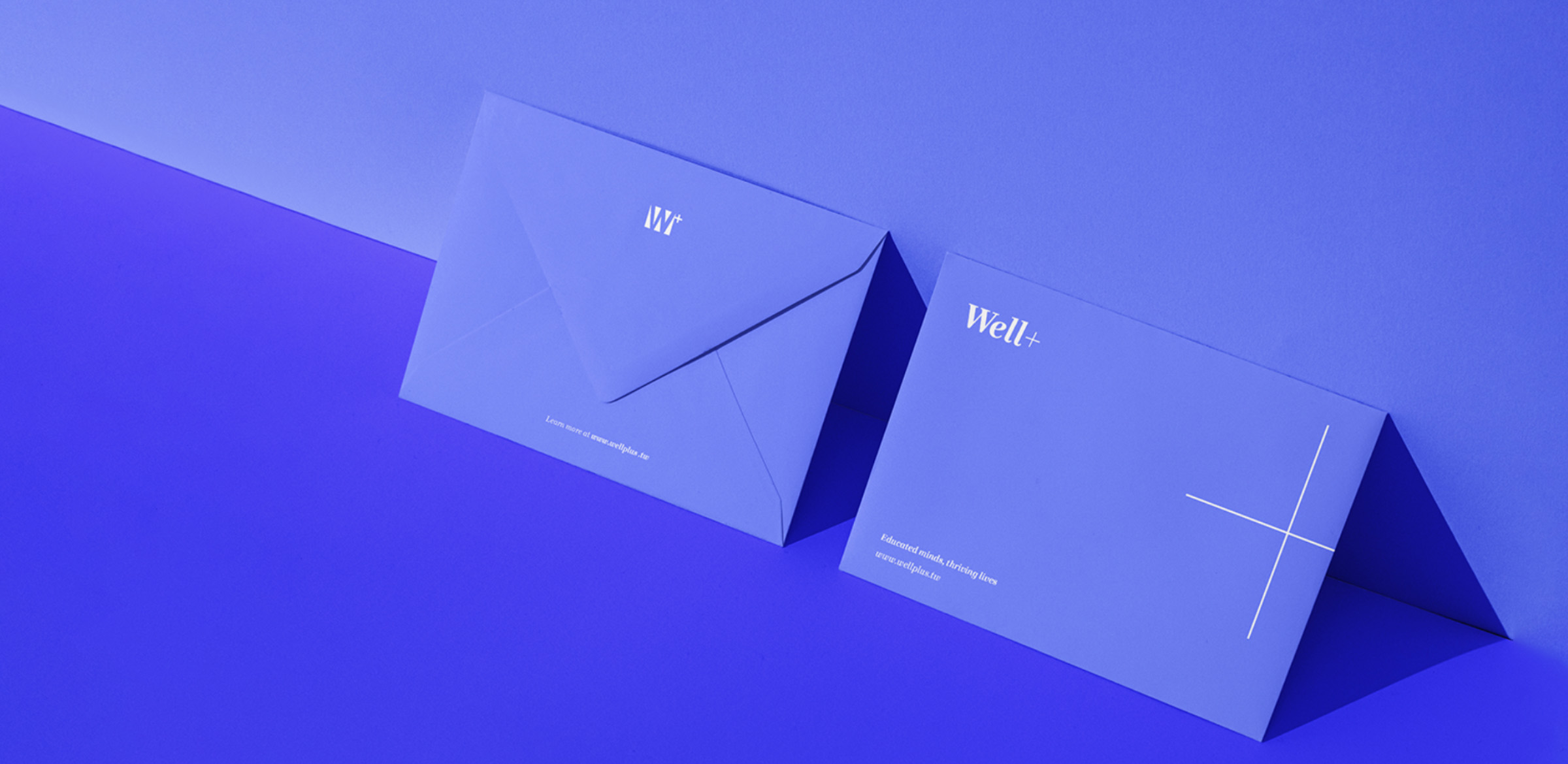
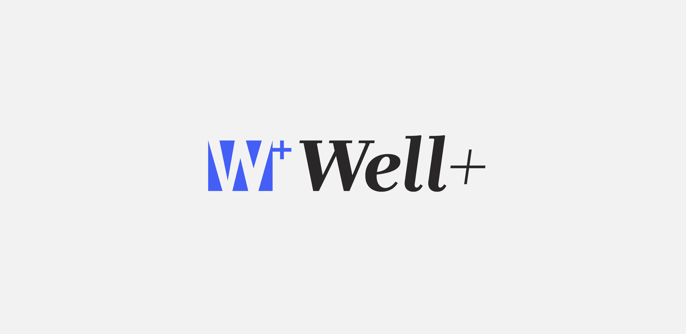
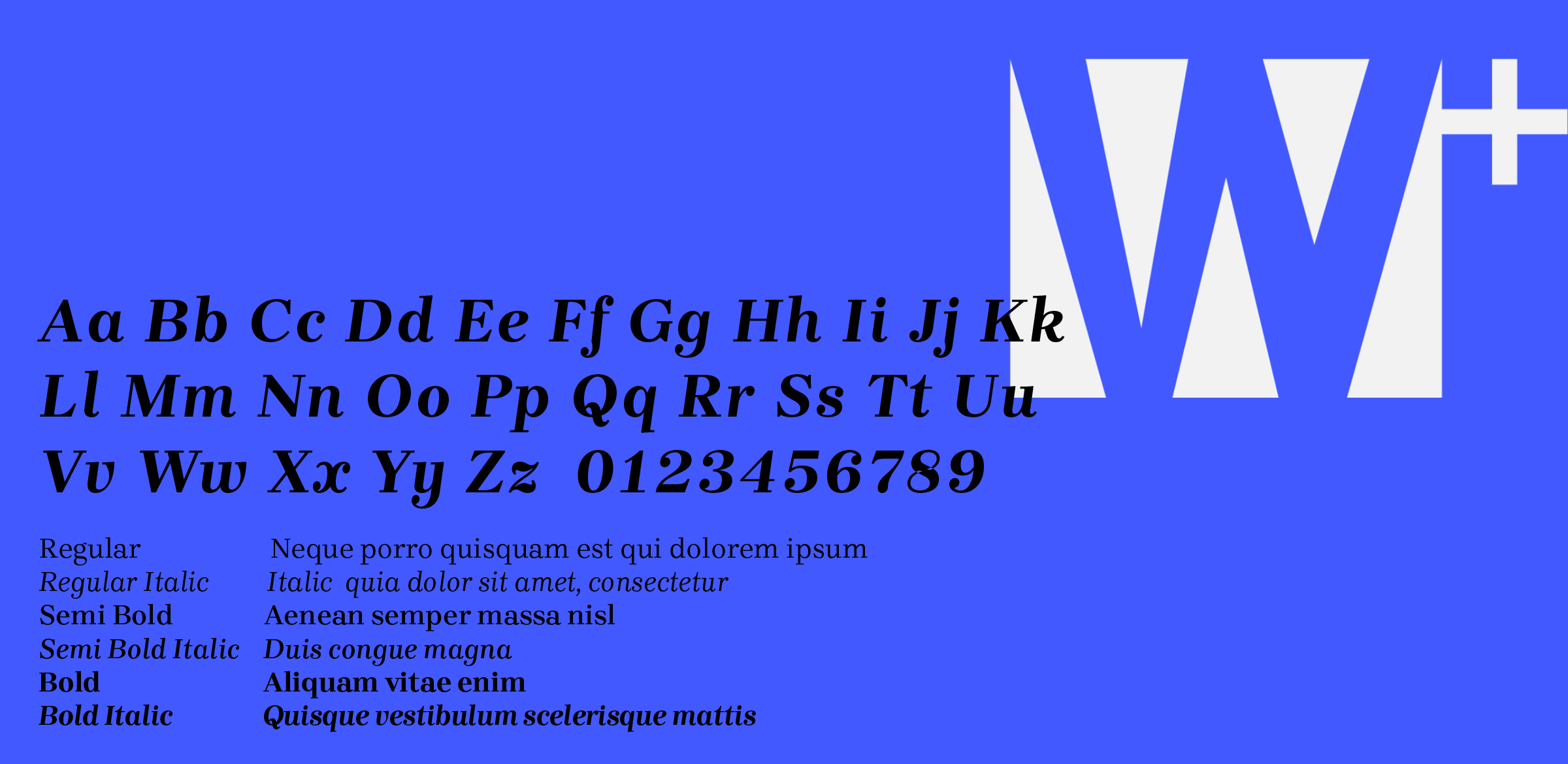
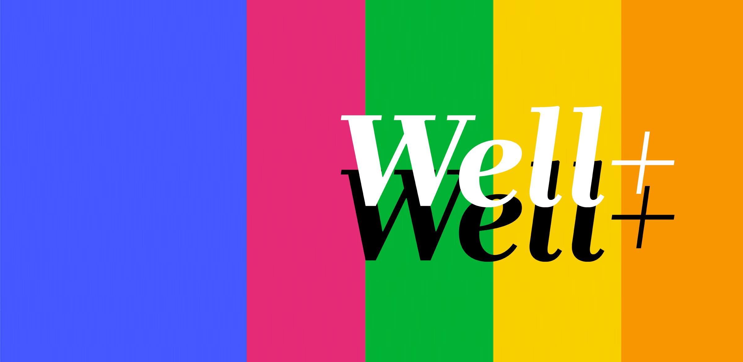
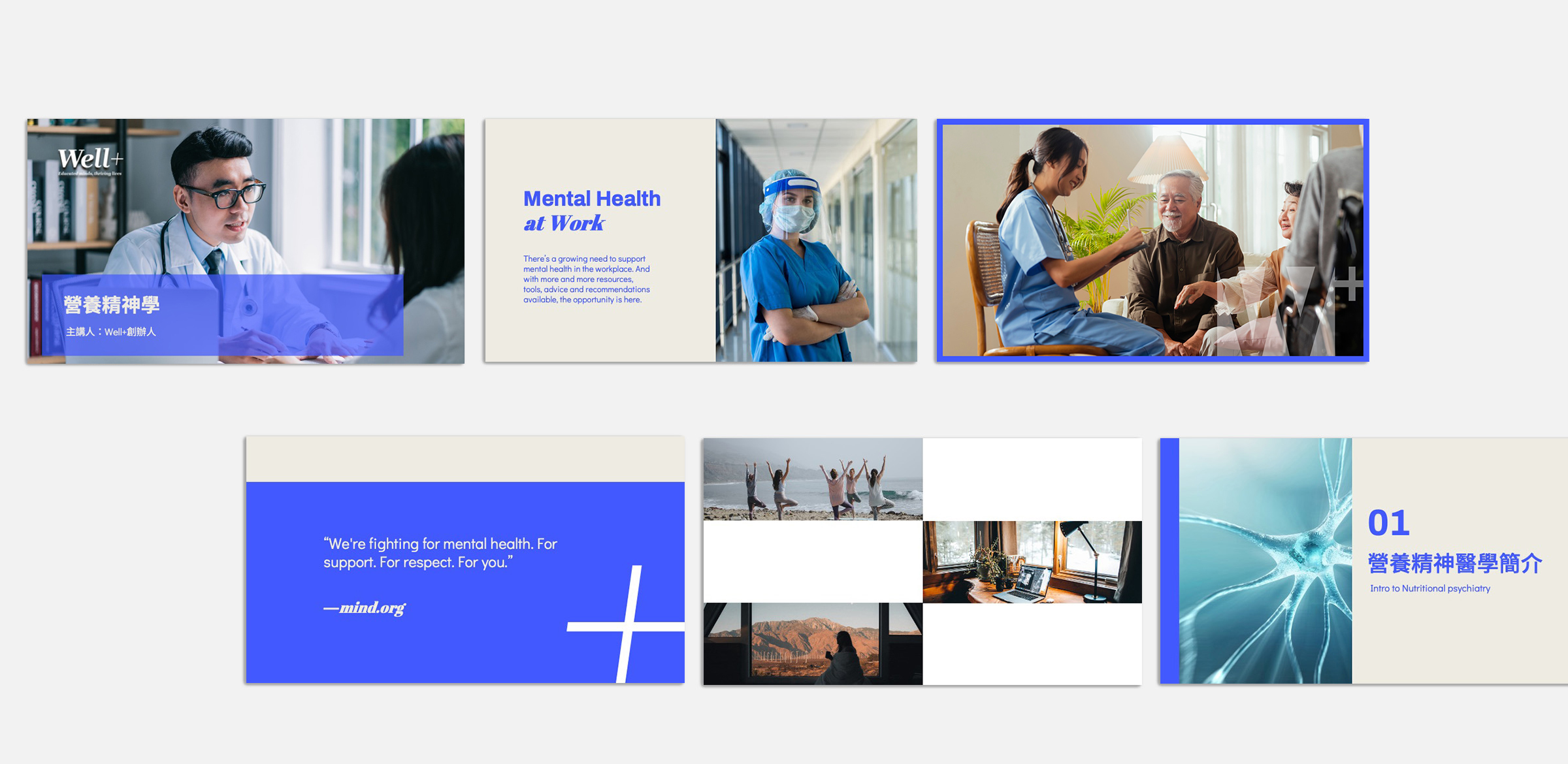
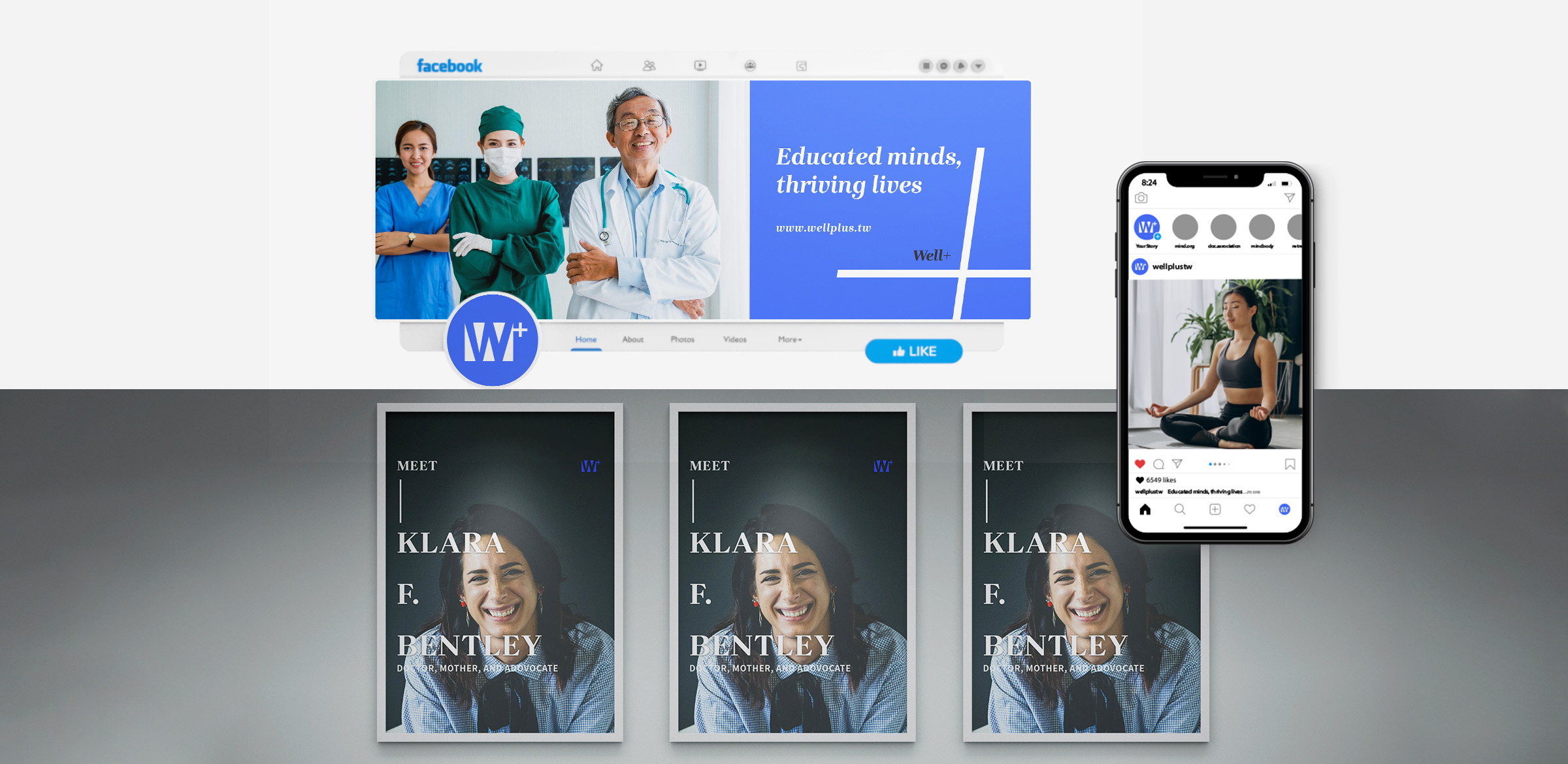
We were appointed to create Well+’s brand identity, focused on learning for mental health and wellness, to get closer to a life well-lived. Its tagline “educated minds, thriving lives” encapsulates in a few words the brand purpose. Moreover, the logo, a bespoke word marque, where the sign plus emphasizes the brand’s messaging and voice: To pursue the infinite human potential through learning, feel better, live more. Shades of vibrant blue dominate the color palette, an update of traditional medical colors that lends Well+ a more dynamic look, broadening its reach. Finally, photography is diversified to represent people from all walks of life: “real people, real-life moments”.
CAPABILITIES
Brand Guidelines, Colour Palette, Logo, Stationery

